So, for my logo I knew I wanted to use the same image from my last post on image tracing, especially because I feel like it goes well with my brand name. In terms of contrast, I always like playing with red because it attracts the eye and, of course, adds contrast. For the logos at the top and the center left, I contrasted the size of the letter T with the rest of the word and went further by changing it to the red I used in my projects color story in the middle logo. I also italicized the type so it aligned better with the slant of the runner. The logo in the center right contrasts with red text on a red box as well as the stroke on the type contrasting the solid fill of the box. The red fill is a different red than the other logos but the original color blended too much with the black runner in the back and I wanted to see what a boxed logo would look like. Lastly, I know we only needed four logos but I wanted to do another take on the runner behind the type so I put the bottom logo together just to see what it would look like.
Image Trace


While I find this technique to be very interesting, I do not think I would use it to create my logo. I like the initial tracing of my photograph because it made everything look seamless and gave the image the look that I was going for. However, after expanding the image and trying to recolor it, things started to fall apart. I realized how different the image started looking when using purely solid colors to fill it in and no shades or tints to create shadows or highlights like in the original tracing. There were so many tiny, oddly shaped paths that it made recoloring the image difficult and produced more of a choppy, unblended result that I was not happy with. I went back to the original image a few times to see if playing with the paths, corners, etc. would help with that but I had no luck. Maybe practicing with the tool more will give me the result I am looking for, but based on this experience I do not think I would use this technique for my logo.
Brand


The brand I have chosen to do is Nike. Out of all the popular sportswear brands, Nike is the only brand I have really ever connected with or consistently worn myself. I believe that Nike has become a classic brand that you can wear at any time. You can always expect Nike to bring new and sometimes unexpected styles to sportswear while always staying true to their brand and moving forward with the flow of fashion. For this post, most of the styles that I have chosen are from their men’s wear line. When it comes to sportswear, I find myself gravitating more towards unisex or men’s wear apparel because I find the shape of the garments more appealing. I also have more outer sportswear garments because I like the idea of workout apparel that holds up in colder, more sever temperatures.
Trend Research | Japan
Upcoming Trends


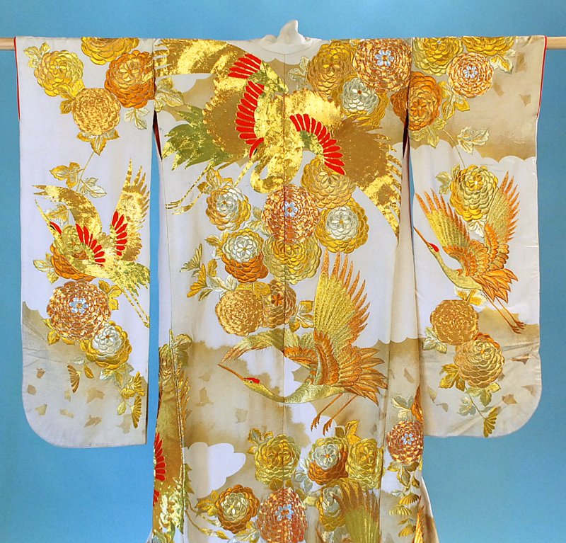


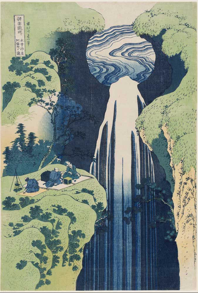
The minimalist trend approaching activewear in fall/winter 2020 resembles the minimalist silhouettes in both modern and traditional Japanese fashions, usually consisting of a more straight shape. The reflective trend faintly reminds me of the gold embroidery sometimes found on Japanese kimonos. Although there is a slight difference between the two I think they both generally convey the idea of shiny details. Lastly, the colors in the digital color palette from WGSN’s Active Color A/W 20/21 reflect colors that I see often used in Japanese garments, tattoos, art, etc.
Culture | Japan


- Tattooing was officially prohibited in Japan in 1871 (but people did them anyway)
- Sashiko is a traditional form of Japanese hand sowing
- The city of Tokyo was originally called Edo
- the most important school of painting in the Momoyama art period was the school of Kano and consisted to of large scale nature paintings of birds, plants, water, etc.
- Anime first appeared around 1917
Spaced Out – Xena | Anime Yourself(ie)

- Changed hair, skin, and shirt color
- Enlarged my eyes in liquify and with the bulge tool
- Shrunk my noes with the pucker tool
- Made my face, lips, and jawline smaller
- Brushed pink on my cheeks and a little red on my brows
- Changed the color of my background and added some stars and a planet
Post a Poster, Any Poster


For this post, I chose this random poster for a Paul Smith fashion show that I found on google because I liked the overall look and personality of it. I am a fan of imagery that is relatively simple and sleek because I think that it makes an ad or image look more more elegant, appealing, and effective. However, I am not the biggest fan of a purely black and white ad, so I already knew that I wanted to incorporate red somewhere into the poster to satisfy my preferences and to add some contrast. Lucky for me, I already had a great image of Ashton Sanders that has a decent amount of red in mind. Unfortunately, after converting the file to a JPEG, the poster lost a bit of its contrast and saturation. but overall it held up pretty well. I also liked the fonts in the original so I tried to find fonts that looked as similar as possible.
So, after masking out the portions of the image I wanted and making the rest black and white, I added a border that frames the model like in the original poster. Once I did that, I took the exact same shade of red that is in Sander’s hat and used it to fill in the border for repetition and additional contrast. I repeated this same step with the border around the date.
Then, for the text, I wanted to play around with the alignment and effects so that it did not look exactly like the original poster. Honestly, I did not really have much of a strategy for this part. It was mostly me playing with different options until I found something I thought looked the best. For the final product, I ended up with multiple different text alignments. I know it is suggested to pick one alignment and stick with it, but I think the flush left I used for the horizontal text on the left side contrasting with the flush right for the small bit of text on the right side makes for a nice use of negative space that again serves to highlight the model in the image like in the original poster and creates a sort of consistent invisible diagonal line around the poster. For the rest of the text and the box in the bottom right, I wanted them to line up with the border so that everything would flow. I also embossed the text in the top left and the designer’s name so that they would contrast the less important information on the poster. Additionally, I thought it would be cool to add a red drop shadow to the designer’s name to make it look as though the text is being hit by the same direction as the light from the image and for more repetition of the red.
For proximity, I focused on keeping all of the supplemental information together such as the date, ticket price, and time. I also placed “New Trend” and “New Fashion” next to the designer’s name so that they would serve as words that could be associated with the designer or his collection.
Practice

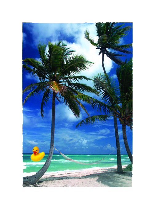


For the ducky image and the sunflowers I played with the hues of the copied images. In the ranch photo I added some extra boots and flipped them horizontally. Lastly, in the beach scene I copied and pasted a the duck in the water.
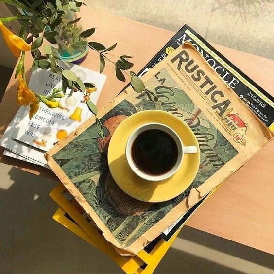
All About Color
FUN. VIVID. NATURAL. PLAYFUL. LIVELY.
yellow, green, and everything in between
I wanted to showcase an analogous color relationship with greens and yellows. Green is my all time favorite color and I think it naturally pairs so well with the color yellow. This combination always gives me summer time picnic vibes.